
PLANNING TOOL
Redesigning a complex product configuration experience to make planning, customisation and purchasing easier
SCOPE
UX Strategy / Information Architecture /
User Flows / UI Design / Prototyping /
Interaction Design
FOCUS
Customer Experience / Product Configuration / Conversion
CHANNELS
Web Application
THE CHALLENGE
The existing Rack It Planner was difficult to navigate and required users to understand complex product terminology and processes before they could confidently build their storage solution. The experience also had friction across onboarding, space planning, configuration and checkout.
WHAT I LED
UX and UI redesign across the end-to-end planner, user flows and information architecture, onboarding and entry-point improvements, interface and interaction design, new planning and configuration functionality.
OUTCOME
A clearer, more guided planning experience that gives customers greater flexibility, improves confidence during configuration and creates a more seamless path from planning through to purchase.
CREATING A CLEARER
ENTRY POINT
CHALLENGE
The original landing page provided limited information before users entered the planner. This was particularly problematic for customers accessing the experience via in-store QR codes on mobile devices.
WHAT I CHANGED
-
Added educational content
-
Improved information hierarchy
-
Introduced clearer product guidance
-
Created stronger pathways into the planner
-
Considered the experience across in-store and digital touchpoints

PREVIOUS VERSION
SIMPLIFYING
ONBOARDING
CHALLENGE
The original onboarding felt visually cluttered and required users to work through a lengthy nine-step tutorial before they could start designing.
WHAT I LED
-
Simplified the UI and visual hierarchy
-
Restructured the onboarding flow
-
Introduced a progress indicator
-
Added a short introductory video
-
Refined product imagery and bundle presentation
-
Improved contextual guidance
RESULT
A more focused onboarding experience that helps users understand the process, see where they are in the journey and get into the planner faster.

UPDATED VERSION

SIMPLYFYING
CONFIGURATION
CHALLENGE
The original interface was crowded and relied heavily on internal product terminology, making it difficult for users to understand how to build and customise their storage system.
WHAT I LED
-
Restructured navigation and product categories
-
Introduced clearer, user-friendly terminology
-
Created guided bay-building steps
-
Improved shelving selection
-
Introduced contextual controls
-
Reduced unnecessary interface clutter
RESULT
A cleaner configuration experience that makes complex product choices easier to understand and manage.
PREVIOUS VERSION


UPDATED VERSION

MAKING SPACE PLANNING
MORE INTUITIVE
CHALLENGE
Users had limited visibility of measurements and flexibility when arranging bays.
WHAT I LED
-
Introduced dynamic measurements
-
Added flexible spacing between bays
-
Improved component placement feedback
-
Designed a broader room-layout experience
-
Enabled users to plan across multiple walls
RESULT
Users can better understand dimensions, spacing and how their configuration will work within a real environment.


EXPANDING WHAT USERS
CAN DESIGN
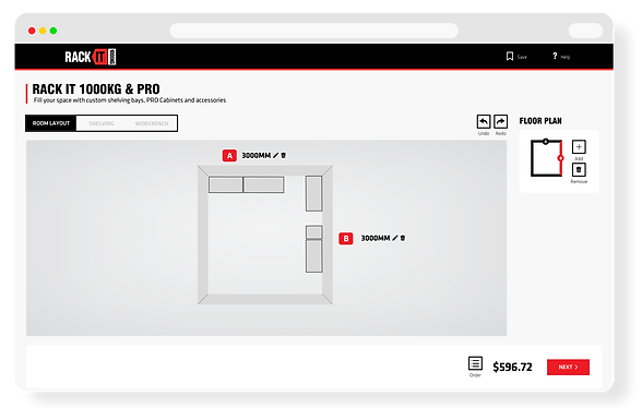
ROOM LAYOUT
Plan across multiple walls and understand the configuration within the full space.
WORKBENCH
Design workstations directly within the main planner, with greater flexibility around stationary and mobile configurations.
SAVE & RETURN
Allow users to save designs at any point, revisit concepts and continue planning later.


CONNECTING PLANNING
TO PURCHASE
CHALLENGE
Moving from a complex configuration to a final shopping list could create additional work and uncertainty for customers.
WHAT I LED
-
Refined shopping-list hierarchy
-
Improved pricing visibility
-
Introduced Starter Kit recognition
-
Simplified the transition from configuration to purchase
RESULT
A clearer purchasing experience that helps customers understand what they're buying and automatically identifies opportunities to save through Starter Kit pricing.
